Strange Attractor
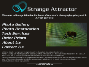
I tried to give Strange Attractor (and, by extension, Atomicat Photography) a clean, cool, stylish look. The site was immersed in engaging photography, and I found that a normal white background would flood into the edges of the darker pictures and ruin them.
I developed the logo, a Lorenz Attractor, with an attractor-rendering program. I wanted something smooth, fluid, and bright, and this combination of shape and colour really brought it out.
I went for a fairly simple design. It was my first web-page, and I went through a couple redesigns until I reached this one. The floating images on the Photo Restoration page were fairly annoying, and I think I eventually gave up and put them in tables.
The Photo Gallery is the result of several revisions and a great deal of fine-tuning. I eventually decided that, while people must be able to see the gallery even with a small screen, they should not be hindered by too large a screen. I redesigned the page to stretch according to the visitor's screen size, so that those with a larger screen could see more detail.
The Embroidery House
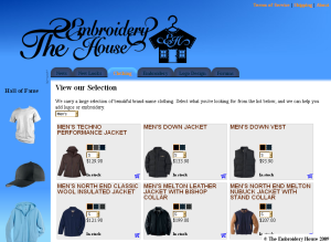
A current job, which will launch as soon as I make it ready.
In this website, I've really needed to think about design elements and layout, because the company needs bright colours. I'm trying to work the page around the ideas in my head, but things appear bafflingly illogical.
Throughout the creation of this site, I've been reading on design and planning, and I've been looking at high-end example from the pages of popular web designers. What I found, in essence, is that I must throw away my narrow mind. I'll often see my ability to affect a single element -- for example, a floating image -- but will have no clue how to alter the surrounding container to act in accordance with a floating element.
I've certainly learned a lot through the creation of The Embroidery House's web page, and plan to implement even more changes in the future.
HTML Business Card

I decided that HTML would be as good as any image editting program. As it turns out, HTML renders in a jumpy fashion, and so no two sizes look the same, even in one browser. It broke completely when view in IE, of course, but I only had to move a couple properties around to get it working. It's supposed to be centered in the window, but IE6 throws it into the top left corner. Oh well.
I've learned more about spacing (see my blog entry), but the actual layout of it is pretty cheap. It's basically just a bunch of right-aligned text. If I make a proper logo, I can fix things up.
This is the card I made for this site, which is useable now, but I've got a different one I'd plan on printing out once I get that domain bought and hosted and build a webpage for it. I just wouldn't be able to work under 'Icosidodecahedron'. The name of it spans the entire business card.